
Even though Moodle functions just fine, sometimes the course overview can be overwhelming and confusing to navigate, especially on the app. Therefore, we had to design and implement an improved version of the Moodle course overview, with a focus on;
- Simple overview
- Quick navigation
- Scanability
- Progressive disclosure
Therefore, we had to create a UI-design based on a design system, create a working prototype in Figma, and implement this design using data from a given API.
UI Design
The first step was to create a design system, which is based on the brand guide for SEA. The design system used can be seen here.
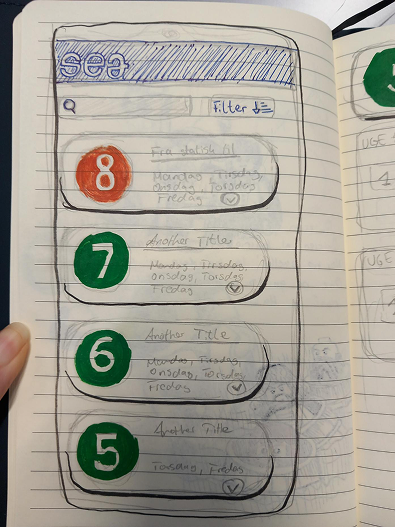
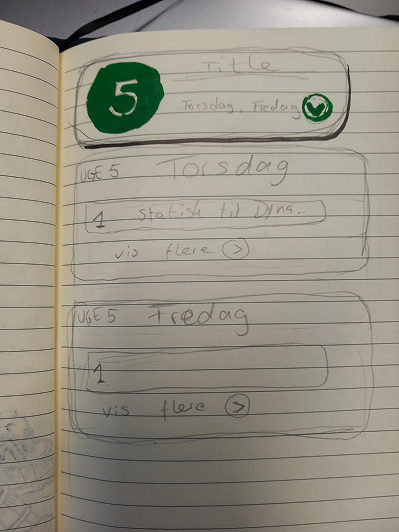
The next step was to figure out what did and did not work in the Moodle app. After we created some sketches to see the direction we wanted to take this design.
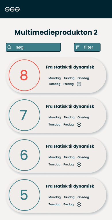
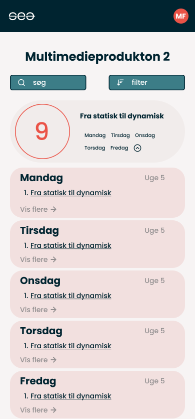
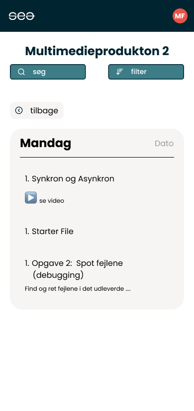
Then we created some wireframes in Figma and experimented with some colours and small tweaks. The final design can be seen below.
Implementation
We started the implementation process by fetching data from the API and creating a template for the data, as seen in the image below. Using the template ensures that the site is dynamic and allows new data to be added automatically.
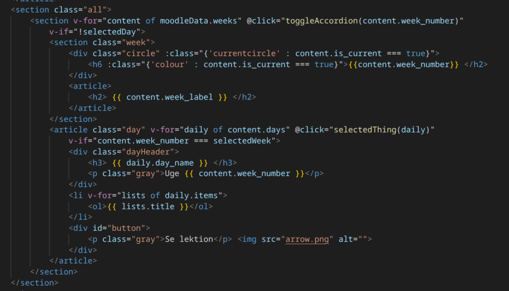
After that, we added the necessary functionality using Vue.js to make the interface interactive and dynamic.
We then finalised the styling with CSS to make sure the finished product matched our Figma design as closely as possible.
Final product
The final product demonstrates an improved, more user-friendly course overview that focuses on a simple overview, quick navigation and scanability.
The final product can be seen here.